Filed under: tidbit
… but I do so love the number seventeen, so today I decided to compile for you, in no particular order, seventeen of my favorite pictures from Flickr.
I’m not saying these are my mostest favorites, just the ones that really got my attention today. If I made the list tomorrow it might be completely different. Also I don’t claim to be a photography critic, these are just things I like. OKAY HERE GOES:
This untitled picture by Neckro is fantastic. At first glance it looks like he’s amazed that a ring has appeared on his forefinger. Then I notice the thumb on the right-hand side of the image, showing that both of his hands are up in the air, and his face takes the appearance of someone apeing being surprised at his own magic trick. Add to that this guy’s crazy look with the very pale eyes, skin almost as white as his shirt, the head pulled back a bit, and a hairstyle that makes him look like he’s traveling way too fast, and you get this wonderful sense of surprise.
Mom in the Car by Patrick Bean makes me smile every time. It has a fantastic retro look that isn’t retro at all because it’s real. The interior of the car, the hair, the clothing, the slide defect – it completely captures the essence of looking at another time.
single basket pour by king seven is a perfect example of “the kind of shot I would never think to take” that helped (helps) change how I think about my pictures. Aside from the composition the colors are rich, lush, and intense. The detail is fantastic.
Tell Me — Who’s That Writing? by _mpd_ is everything that I want to shoot some days: wood texture and natural light. You just can’t get any better than this.
095 by jens b. is a beautiful candid, or if it’s posed then this guy knows his stuff. The choice of crop at eye level and slightly off focus impart a tangible sense of anonymity while the body language is unmistakeable. I feel cold and uncomfortable just looking at this.
Snow Friend? by greenamp just charms me to no end. I passed by this image countless times until one day I really stopped and looked, and found everything perfect. The framing gives a fabulous sense of something missing, and her expression is a mix of curiosity, interest without being overly concerned, and something else I can’t put my finger on (or should that be “something else on which I can not put my finger”?).
Dave by candlelight by fast eddie 42 first came to my attention by way of some article discussing alternate lighting, in this case candles. Everything about this picture screams old-timey wizard until you see the Bic pen, spiral notebook, and pocket calculator.
Fight by Phil Sharp showed me that sports photography can be beautiful.
Morning by lockgruv catches my attention every time I flip through my favorites. I think it’s the way the clothing matches the dark stars while the shirt, the aquarium, and most importantly his eye keep you moving back and forth to the big blue star. His expression isn’t unhappy, but isn’t particularly glad either. It’s just … morning.
thebaby by ***blah just cracks me up. I have no idea what inspired this photo but it is so well done. The best part is that none of the cigarettes are freshly-lit. That would make it too obvious.
I [heart] coffee by *davidsαngle reminds me that though usually I don’t care one way or the other for high-speed photography of objects being dropped into liquid that there’s always an exception to be made. The use of the oblique single flash and otherwise jet-black set is phenomenal.
mum by B0GIE makes me feel like I’ve just done something wrong.
the bees by hackett is another reminder that though usually I don’t have strong feelings about a genre (in this case, flowers) there are stellar standouts that can sway my opinion. In this case the early March sky feels cold, not yet spring, and the addition of the bees really brings it home.
Joyful Ed by *cassiopeia* makes me smile every single time. I think it’s the playing cards on the floor that do it for me.
Butt Head by elo_001 gives me confidence that when I see someone with an interesting face I need to approach them to get their picture – mainly in hopes that I’ll capture something like this. I don’t know who this guy is but he looks like a lot of fun, and his face is supremely expressive. Elo’s choice to shoot against the open warehouse door really brings the subject out.
Cemetary outside Williams, AZ by CalamityJon is the saddest picture of a teddy bear that I have ever seen. If called upon to create a sad teddy bear picture with unlimited time and funding I could not top this image.
And finally,
lena….. by Hensdill is one of my earliest Flickr favorites. There is such an undeniable sense of motion in this picture that it almost makes me recoil. Sometimes I fear for that girl’s safety, as if she’s headed into the mouth of an angry beach beast … and other times I can see it for what it really is.
Filed under: tidbit
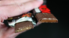
I realize this is incredibly dorky but this is also one of those things that I do for fun, which says a lot about me, I suppose. I have always loved Heath and Skor bars, and only today at age 30 (nearly 31, ugh) did I ever decide to compare the two. Usually I’ll just grab whichever one is closer to me when I’m in the candy bar aisle. Today I picked up both.
There’re a lot of discussions or debates on the internet about Heath vs. Skor online but this is my own interpretation, and hopefully a bit more condensed than some.
For starters the biggest surprise was that they’re both made by Hershey Corp. I had always assumed that they were two competing companies.
Physical appearance:
Both Heath and Skor have the same external appearance – almost exactly the same color of chocolate, same scoring pattern on the underside. Heath is ever-so-slightly thicker whereas Skor is thinner and wider. Without the two side-by-side it’d be hard to tell.
Heath is a much lighter color inside, with more visible almond chunks. Skor is darker and more homogenous.
Ingredients:
Heath:
milk chocolate; sugar; dairy butter; partially hydrogenated soybean oil; almonds; salt; artificial flavor; and soy lecithin
Skor:
milk chocolate; sugar; dairy butter (milk); almonds; milk; and salt
The sub-ingredients for the milk chocolate are the same so I didn’t bother to list them. My initial impression favors Skor for simplicity of ingredients. If you can make a good candy without having to use artificial flavors then do it!
Texture:
Heath bites with a more crumbly and sticky toffee whereas Skor is more firm and brittle. At first I preferred the Heath, but as time went on the Skor won out.
And finally,
Taste:
Here’s where the real difference was, and I didn’t even expect it. Having never tasted them side-by-side I just assumed they were basically the same, but no. Heath comes in with an immediate nutty kick, which leads me to believe that part of the ‘artificial flavor’ is solely to enhance the almondosity of the bar. Skor has a far richer toffee flavor, as if the toffee were cooked down longer, and has far less of an immediate almond impact.
So,
Overall:
Skor is the winner, hands-down. I know it’s ridiculous to consider the ‘healthiness’ of a candy bar but I still prefer simpler and fewer ingredients. The toothsomeness of the bar appeals to me – by the end of the Heath it seems a bit smashy-chewy, whereas the Skor retains crunch. Finally, the flavor of the Heath seems a bit manipulated whereas Skor comes across more natural yet at the same time more intense.
And now you know. That is, if you read this far.
I love you, Skor! I’ll never betray you again.
Well, you know, unless I need a Heath Blizzard from DQ or something.
Filed under: tidbit
My mom just got back from a little vacation to Florida. I was expecting her to return with a present for me, namely:
+ One Canon 80-200mm telephoto lens
But instead, she returned with, in ascending order of awesome:
+ One t-shirt with prints of old-timey kitchen implements
+ One coffee mug that fits my collection perfectly (I have the most hip coffee mug collection in town, ask anyone, no, seriously, it’s true)
+ One bottle of wine
+ One Canon 80-200mm telephoto lens
+ One bottle of Roddenbery’s Cane Patch Syrup
+ One jar of guava jelly (if you don’t know what this is you are missing out on life, and don’t come over and ask to try mine because I ain’t sharing with NO ONE)
And that, folks, is why my mom rules.
Okay, I can’t lie – my Dad had a big hand in choosing and bringing a lot of this stuff. Maybe I should have split this list in half and posted the latter portion on Fathers’ Day or something. Or maybe I’ll just make up something then and leave Mom out of it to make it even.
BUT ANYWAY my mom is probably way cooler and more awesome than your mom, but I don’t want to say that too loud ’cause what’s the point of making you cry on Mothers’ Day? That’s just mean.
Filed under: tidbit
I had my first intensely synesthetic experience today and it was fascinating – to me, of course, not you. You weren’t there.
The album Colony by In Flames had been in my car’s CD player for weeks. Yeah, I know that’s kind of messed up but I don’t drive often and so I don’t hear it with great enough frequency to get tired of it BUT ANYWAY it’s been in there for a long time. I must also mention that my copy of Colony is an audio CD that was made from rather poor-quality MP3s so it always sounds flat. The highs are always a bit muted, the lows never quite … there, if you know what I mean. I’m no musiconomist so cut me some slack on the proper terminology.
After weeks of listening to Colony on and off I was finally ready for a change. I opted for III: In The Eyes of Fire by Unearth. In case it’s not obvious I’m on a little bit of a metal kick. The first track on III does not mess around – there’s one single second of intense drums and then the whole of everything comes crashing in. I have to make mention that this is an honest audio CD, mastered correctly and sounding great as opposed to some crappy home rip. So as I’m being assaulted with this wall of ferocity and pleased at finally getting some depth in my music I literally think, “Ahhhh, this looks right.”
And I meant “looks”, not “sounds”, because at that moment my brain was completely taken over with the image of a perfectly-contrasted and balanced photograph. There was no distinct image, no picture I can relate back to you but all the same I saw it as clearly as I was hearing the music. The darks were jet black, the lights were brilliant white, and everything else in between was all of the appropriate shades and colors (though mostly muted or earthy green, brown, and blue-ish). I can’t begin to describe how surreal the experience was because … well, it was involuntary. See, I can make the analogy that Colony was that washed-out flat snapshot that I know all of you (and I’m included in this) have taken. III: In The Eyes of Fire was that image you see on the front of a travel magazine. There’s an obvious difference.
I didn’t consciously make an analogy, though. Apparently my mind chose to deal with that difference in purely optical terms. That’s why I’m making these claims of synesthesia – those wires felt crossed. The new music just looked right and it took me a full second or two to even understand why music looking right wasn’t the correct way to experience it.
I’m reminded of that Mitch Hedberg quote: “I was walking down the street with my friend and he said ‘I hear music,’ as though there’s any other way to take it in. ‘You’re not special. That’s how I receive it too… I tried to taste it, but it did not work.'”
I think it’s like when you try to breathe that water you’re drinking – I must have just tried to take it in the wrong way. I wish I could do it again.
Filed under: photography
WARNING: This post may be terribly boring for anyone not interested in photography. Proceed at your own risk.
EDIT: As JTJ pointed out in the comments all my discussion here is not really film vs. digital but instead ‘cd production machine at the 1-hour photo place vs. digital’. It’s still valid for me because that’s exactly how I would and will get film developed (because I am cheap) but it’s … yeah, anyway, read his comment for the rest.
So where to start? I guess I’ll start by saying I recently decided to shoot some film. As I mentioned, Sarah’s pictures got me thinking about film, and I just happened to be able to steal Trey’s camera off of Henry.
I was excited about film for three reasons:
1.) This whole concept of reportedly better tonal range
2.) Lack of chromatic abberration (purple fringing)
3.) Full-frame shots as opposed to cropped sensor
Let me take those one by one. First up, tonal range. I’ve heard people mention that they’ve gone back to film because of greater tonal range. Now I don’t know nothin’ about nothin’ and can’t be bothered to read up on it because my eyes start to glaze over on technical specs and everything seems to be infused with a whole ton of personal opinion anyway. I figured I’d just look for myself. The base idea here is that the film has more detail in the darker and lighter areas than the digital.
Secondly, chromatic abberration comes in many forms but the one with which I am most concerned is the dreaded purple fringe. I’ll let you read the Wikipedia article on fringing since it has pictures and a better description than I can come up with (better than one up with which I can come?). Everything I’ve heard is that film is far less susceptible to this but I wanted to see for myself. Now my digital camera is pretty nice, it’s not bad for producing purple fringing, but I do know situations in which I will encounter it and so I try to avoid them.
Finally, full-frame shooting versus cropped sensor. I will again point you to the relevant Wikipedia article but the oversimplified short version is that the sensor inside my camera is physically smaller than a 35mm piece of film, which means my field of view is reduced and I’m not seeing the true edges of my lenses.
Before I go into the results let me say this: I am an idiot when it comes to Photoshop and color spaces. I don’t really understand what’s going on with them.
I got my film developed and put straight onto CD. When I looked at the pictures they were a bit washed out, and I was disappointed. Then when I took them into Photoshop and did nothing but re-save them the results were a lot better than what I’d been seeing originally. So. I feel that I must have saved them under a different color space, but I don’t know enough to know what I did. I’ll come back to that in a bit.
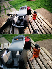
For reference, I used Fuji 200 film on a Canon EOS Rebel X body. When taking the comparison shots with my Canon Digital Rebel XT I set the ISO to 200 to match.
I’m going to give you this image of the amphitheater at Dogwood Park first:

The top is film, the bottom is digital, both shot with the same Sigma 20mm lens. First up, tonal range: film wins. The best example is the sky: where the digital shows nothing but white the film gives some cloud detail. Though, as said before, I didn’t see this originally when I looked at the images – they were washed out. Photoshop rescued this, and I’ll have to research how.
Past that there was no noticeable fringing on the film, but also none really on digital. The crop factor should be obvious as the digital shows far less than the film.
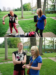
Second example:
Same layout, top film, bottom digital. The film is far more contrast-y. Oddly enough the orange bottle is more vibrant on film, but the red bag looks better on digital. I have to say that overall the film appeals to me more.
This is the point, though, where I have to say that now that I’ve seen exactly what my digital camera can do as compared to an equivalent film camera I am not ready to abandon it by any means, or start shooting film on a regular basis. The advantage that film has in initial appearance is seriously outweighed by the convenience of digital in every other aspect.
Third comparison:
In this I actually prefer the digital. The film is too contrast-y and has a look that I try to avoid when doing digital post-processing. Initially the film was far too washed out on the skin tones but one quick save in Photoshop and everything has changed. I’m really going to have to go learn more about color spaces.
At this point I had to abandon my digital camera body because I kept fretting too much about taking pictures with film and “wasting” film. I was shooting more with my digital body instead. So, I forced myself to give up the familiar and go out and finish some rolls.
Here’s a shot directly into the sun on a purple fringe test. It passed with flying colors:
A few last things: I bought both Fuji 200 film and Kodak 200 film. Overall there was very little difference in the films. I took some comparison shots of this car and the Kodak came out the winner by the slightest of margins. In the mid tones and shadows the Fuji has a bit more blue whereas the Kodak puts out a bit more red. Still, the Fuji was cheaper and the color difference is definitely not worth the price difference.
All of the pictures I shot on film that were worth uploading are here: film set.
Also, I noticed with the film that my highs were blown out more often than on digital. Should I go out shooting film again I need to be more careful with regards to what I meter off of.
Summary: I really like the way the film looks, but this is only after I take it into Photoshop and re-save. So, therefore, it’s not really any faster to me than taking my digital images into Photoshop and tweaking them ever-so-slightly (or really hard if the situation and my mood warrants). Therefore I’m giving (for me, personally) the winning title to digital based on convenience.
Are you still here? Wake up! Go outside and take some pictures.
Filed under: tidbit
Thanks! Good to be back. We have an awesome show for you today. First up is a little note for all you Cookeville people. Who here lives in Cookeville?
[ scattered applause and cheering ]
Great, I thought so! Well listen, if you like bread – and don’t we all – then you gotta visit the Mexican bakery here in town. It’s on Hickory between Broad and 1st Street in that old building that used to be a washateria. You know where I’m talking about? I saw a guy in there today with his tray piled a foot high with every kind of bread you can imagine and his total was only twelve bucks. They have normal bread, pastries, filled pies (or empeñadas if you prefer) and even a ham and cheese croissant. You gotta check this out! You know what? You’re all so awesome that you probably already have.
[ audience: awwwwwww ]
Secondly, I have another recommendation for you. You may think you’re adventurous. How many of you are adventurous?
[ wild clapping and hooting ]
Well DON’T BE.
[ crickets ]
At least not with regards to new Pepsi Summer Mix (tropical fruit flavored cola: great job). Be on the lookout for this bottle and avoid at all costs:
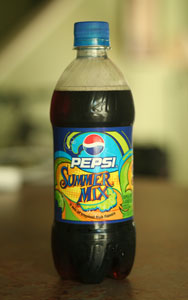
That is, unless you might have somehow thought that dissolving a handful of Jolly Ranchers plus half a bag of cotton candy into your Pepsi was a good idea.
[ audience: ugh, eww, etc. ]
Let it never be said that I won’t take one for the team. Dranktank, you can thank me later.
Alright, folks, that pretty much wraps up the show for today. I need to get to a hospital to have this sudden onset of diabetes taken care of. Goodnight!
[ applause, lights down ]
Filed under: photography
I figured I would share my new favorite Flickr photoset with you – the set Charles by empirik.
Charles fascinates me because he’s such a helper. The first time I saw him he was cleaning empirik’s Nikon. He is also apparently fond of adventure.
There’s something excellent in the way that empirik treats Charles as the subject that fascinates me. There’s a difference between taking a picture of a toy and taking a picture of a person, and somehow empirik is crossing that line in a way I have yet to understand. Regardless, I really enjoy it.
Filed under: tidbit
It’s May. Have you checked your credit report yet? It’s been four months since I reminded you that you get three free credit checks per year. Go do it. It’s healthier than bran muffins.